How to Sign Your Name in Cursive: Step-by-Step Guide
Learning how to sign your name in cursive is less like learning a new skill and more like editing something you already own. You have been writing your name for most of your life. The task now is to turn that familiar sequence of letters into a mark that is quick, personal, and dependable. This guide takes a workshop approach. First you audit your current handwriting, then you design the signature in layers, then you put it through a set of stress tests, and finally you decide whether you also want a clean digital copy.
Why Most First Attempts at a Cursive Signature Fall Apart
Picture someone named Daniela Whitcombe sitting down with a fresh sheet of paper. She writes her name with a huge looping D, a sweeping underline, and a flourish off the final e. It looks fantastic. The next day, signing for a package on a cramped handheld screen, she produces something unrecognizable. Two weeks later, at the bank, she produces a third version.
The problem was not her handwriting. It was that she designed for one perfect moment instead of for everyday conditions. A signature lives a hard life: it gets written standing up, on bumpy surfaces, with cheap pens, inside tiny boxes, and when you are in a hurry. Every decision in this guide is aimed at making a signature that holds together in those situations, not just on a quiet afternoon at a desk.
That shift in mindset changes what counts as a good signature. Impressiveness matters less than repeatability. Legibility matters, but only up to a point. And the most valuable feature is a shape your hand can produce on autopilot.
Step One: Audit the Handwriting You Already Have
Before inventing anything, collect evidence. Grab a few samples of your own writing: a shopping list, a note, the way you write your name when nobody is watching. Then answer three questions.
- Which way does your writing naturally lean? Some people tilt right, some stand upright, a few lean left. Your signature should follow your natural angle rather than fight it.
- Which letters do you already form with confidence? Maybe your capital M has always had a nice bounce, or your lowercase g has a tidy loop. These are free assets.
- Where does your pen hesitate? Watch for spots where you slow down, retrace, or press harder. Those are the places that will break under pressure.
This audit gives you raw material. A signature built from shapes your hand already likes will settle far faster than one assembled from someone else's style.
How to Sign Your Name in Cursive in Five Steps
With your audit done, here is the core method in a nutshell. Each step gets fuller treatment further down.
- Decide how much of your name to include. The format sets the length and rhythm of everything else.
- Choose one or two signature letters. These are the letters that will carry your identity.
- Simplify everything between them. Middle letters can shrink, flatten, or merge.
- Plan where the pen lifts. Decide in advance where breaks happen, so they feel intentional.
- Stress-test and lock it in. Write it in difficult conditions and keep the version that survives.
If you want structured lines to practice on while you work through these steps, type your name into the cursive worksheet generator and print a tracing sheet with ascender, midline, baseline, and descender guides.
Choosing a Format That Fits Your Name
Name length is the biggest factor here. Compare two people. Li Na has four letters in total; writing the full name is effortless, and she can afford a confident finishing stroke. Alexandra Montgomery-Price has twenty-plus letters and a hyphen; writing every character every time is a recipe for fatigue and inconsistency.
Some options to try:
- Full name — suits short names, or situations where people need to identify you clearly.
- Initial plus surname — "A. Montgomery-Price" keeps the family name readable while saving time.
- Initials only — "AMP" can become a compact monogram for tight spaces.
- First name only — friendly and informal, ideal for cards and notes to people who know you.
Many people end up with two related versions: a full signature for formal paperwork and a short form for receipts and quick sign-offs. That is perfectly fine as long as both share a common opening or closing gesture, so they clearly belong to the same person.
Picking Your Signature Letters
Every memorable signature has a hero or two. Look at your chosen format and find the letters with the most visual potential. Capitals are obvious candidates, but they are not the only ones. A lowercase f, h, k, or l gives you height. A g, j, p, or y gives you depth below the line. Double letters, such as the tt in "Scott" or the ll in "Kelly," can become a distinctive rhythm.
Choose one primary hero and, at most, one supporting one. If Scott decides his capital S will be the star, he might give it a generous upper curve and then let the remaining letters run small and quick. His crossed double t becomes the supporting feature, a single bar sweeping across both stems. Two features are enough to make the signature recognizable. Five features make it fussy.
For ideas on how standard cursive forms each capital, the cursive alphabet reference on Cursive Generator shows every letter and is a good place to see where a capital begins and ends before you start adapting it.
Simplifying the Letters in Between
Once your hero letters are set, everything else becomes supporting cast. This is where signatures get fast. Common simplifications include:
- Turning a row of small rounded letters, such as "anne" or "mm," into a gentle wave.
- Dropping the dot on an i, or replacing it with a short dash written on the way out.
- Merging the crossbar of a t into the stroke that follows.
- Letting tiny letters like r and s shrink until they are suggestions rather than full shapes.
The test for a simplification is simple: does it still sit comfortably in the overall outline of your name? If someone who knows your name would recognize the silhouette, the simplification works. If the middle collapses into a flat line, you have gone too far, and you need to restore one or two bumps.
Planning Where the Pen Lifts
There is a myth that a "real" cursive signature must be one continuous stroke. In practice, most good signatures contain at least one deliberate break. The space between a first name and a surname is the most common place, but you might also lift before a complex capital, or after a hero letter that ends awkwardly.
What matters is that the breaks are planned. An unplanned lift, where the pen stalls because you were not sure what came next, leaves a blob or a shaky restart. A planned lift feels like punctuation. Try writing your name three ways: with no lifts, with a lift between names, and with a lift after the first capital. One of these will feel noticeably smoother, and that is the one to keep.
Finding Your Signing Speed
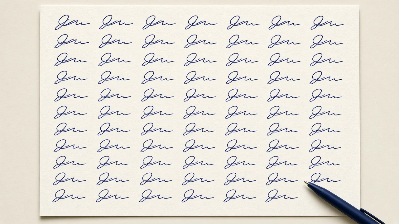
Speed shapes a signature as much as letterforms do. Write too slowly and the result looks traced and wobbly. Write too fast too early and the shapes never form properly.
A practical exercise is to sign at three tempos. First, slow enough to watch every curve. Second, the pace you would use to write a quick note. Third, as fast as you can while still keeping the hero letter intact. Compare the three. Your target is usually the middle one, nudged slightly faster over time. As the motion becomes automatic, the signature will naturally speed up without losing its structure.
Notice also how size behaves. Draw two faint guidelines and check whether your capitals reach a consistent height and your small letters share a common size. Consistency here makes a signature look intentional even when it is simple.
Stress-Testing Your Signature
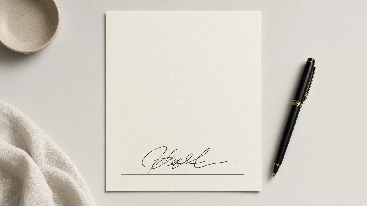
Once you have a candidate, try to break it. Sign:
- In a box about the size of a credit card slip.
- On a sticky note held against a wall.
- With a cheap ballpoint, a gel pen, and a felt tip.
- With your eyes looking elsewhere for the final half.
- Ten times in a row as quickly as you comfortably can.
Lay the results side by side. You are not looking for identical copies, because handwriting always varies. You are looking for a family resemblance: similar starting point, similar width, the hero letter clearly present, the same general ending direction. Any element that disappears or changes wildly under stress should be simplified further.
Repeat this test a week later. Signatures often evolve during the first few weeks as your hand finds shortcuts. If the evolution keeps your hero letters and makes things easier, accept it.
Mistakes Worth Avoiding
- Borrowing a celebrity's design. It was shaped around their name and their hand, not yours.
- Stacking flourishes. A loop on every capital plus an underline plus a tail is exhausting to reproduce.
- Slashing through your own name. An underline that crosses the letters makes the signature harder to read.
- Switching versions on a whim. Inconsistency makes your signature harder to recognize over time.
- Writing so cautiously it looks stiff. A signature drawn letter by letter loses its natural flow.
Previewing Ideas With a Signature Generator
Sometimes you know what you want to feel like but not what it should look like. A generator can spark ideas. Type your name format into the signature generator, which offers 51 curated signature and handwriting-style fonts (a selection from the site's full library of 121 open-source fonts). Scroll through the options and note which capitals catch your eye, how different styles handle spacing between names, and whether you prefer upright or slanted letters.
Treat what you see as inspiration rather than a template. Borrow one idea, such as the angle of an entry stroke or a particular way of crossing a t, and then try it in your own hand. If you would rather browse your name across a wide range of cursive styles first, the name in cursive page is another quick way to compare looks.
Cursive Generator is free, does not require an account or email, and renders text in your browser so nothing you type is uploaded to a server.
Making a Digital Version (and What It Is Not)
You may also want an image of your signature for an email footer, a portfolio, a slide deck, or a personal website. From Cursive Generator you can export a transparent PNG, which drops neatly onto any background, or an SVG vector file that scales to any size and can be opened in Figma, Illustrator, or Inkscape. Exports carry no watermark.
Be thoughtful about where that file goes. Anyone who has it can paste it anywhere. More importantly, an image of a signature is a design element, not evidence that you agreed to something. For contracts, bank forms, or anything legally binding, follow the signing process required by the organization, the platform, and the laws where you are.
Frequently Asked Questions
How do I start if my handwriting is messy?
Start with the audit. Even messy handwriting usually contains one or two letters you form well. Build the signature around those, simplify the rest, and practice at a moderate pace.
Do I need to connect every letter?
No. Plan one or two deliberate pen lifts, typically between names or after an elaborate capital. Planned breaks look cleaner than forced connections.
How long until my signature feels natural?
It varies. Brief, frequent practice usually works best. Once your hero letters and the simplified middle come out without thinking, you are close.
Can I have more than one signature?
Many people keep a full version and a shortened version. Make sure they share a recognizable feature so they clearly belong together.
Is a generated signature image legally valid?
A generated PNG or SVG is a visual asset. For legal or financial documents, use the signing method the document and platform require.
Is the Cursive Generator signature tool free?
Yes. It is free, needs no sign-up, adds no watermark, and runs in your browser.
Try it yourself — free
Runs in your browser. No sign-up, nothing uploaded.
Open the free tool →Related posts
Cursive Capital Letters: A to Z Guide for Beginners
Learn cursive capital letters A to Z: why uppercase script differs from print, which capitals are hardest, and how to practice with free charts and…
Read →
Cursive Fonts for Instagram: Copy & Paste Script for Bios
How cursive fonts for Instagram work, why copy-paste script is really Unicode symbols, and how to use it in bios and captions while staying readable.
Read →
Cursive Tattoo Font Guide: Pick a Script That Ages Well
How to choose a cursive tattoo font: five tests for script lettering, six well-known styles scored, placement and size tips, and how to preview your…
Read →