Cursive Tattoo Font Guide: Pick a Script That Ages Well
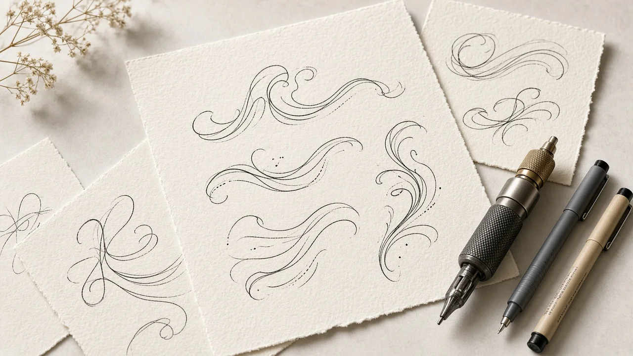
Choosing a cursive tattoo font feels easy right up until you realize the tattoo will outlive the screen you chose it on. On a monitor, script lettering sits perfectly still, every hairline razor sharp, every loop crisp against a white background. On a person, the same letters are stretched over muscle and bone, exposed to sun, and slowly softened by the body as the years go by. A font that wins on screen can lose badly on skin.
This guide approaches the problem the way a careful designer would: by setting criteria first and judging fonts second. We start with five tests any script should pass before it goes anywhere near a stencil. Then we run six widely known script styles through those tests, look at how body placement changes the answer, and finish with a simple workflow for turning your idea into references your tattoo artist can actually use.
Why Script Is the Hardest Lettering to Tattoo
Block letters are forgiving. Their shapes are simple, their counters are large, and each letter sits alone. Cursive is the opposite. Letters touch, thin strokes alternate with thick ones, and small enclosed spaces appear wherever a loop closes. All of those traits are what make script beautiful, and every one of them is a weak point once ink is involved.
Over time, tattoo lines tend to spread slightly. When two strokes sit very close together, that gradual spread can close the gap between them. The inside of an e or the eye of a loop can fill in. Hairline strokes, which give script its elegant contrast, may fade more than their heavier partners, so a word that once looked balanced starts to look patchy. Script also has to survive the physical shape of the body: a word that looks straight on paper may bend around a forearm or ripple across ribs.
None of this means script tattoos are a bad idea. They are among the most popular tattoos for good reason. It simply means the font has to be chosen, and usually adjusted, with skin in mind rather than paper.
Five Tests for Any Cursive Tattoo Font
Run every candidate through these five checks. A font does not need a perfect score, but serious weaknesses on two or more are a warning sign.
Test 1: Stroke Weight
Look at the thinnest part of each letter. If those strokes are barely visible at the size you are considering, they are likely to soften further over time. Fonts with a moderate minimum stroke, where even the thin parts have some body, tend to hold up better than ultra-delicate display scripts.
Test 2: Breathing Room Between Letters
Zoom in on the joins. Are letters touching only where they connect, or do loops and tails crowd neighboring letters? Healthy script leaves a little air around every shape. If letters overlap or nearly touch in several places, expect your artist to open them up.
Test 3: Openness of Enclosed Shapes
Check the small enclosed areas: the eye of a lowercase e, the bowl of an a or o, the loop of an l. Larger, rounder openings stay legible longer. Tiny, tight loops are the first to fill.
Test 4: Restraint in Decoration
Swashes and flourishes add drama, but each one is another line competing for space. Count them. A single expressive capital is usually plenty. If nearly every letter has an ornament, the word may read as texture rather than language.
Test 5: Readability at a Glance
Show the word to a friend for two seconds and ask what it says. If they hesitate, strangers will too. Unusual capitals are the most common culprit, because many script alphabets reshape letters like Q, G, and Z in surprising ways.
Six Well-Known Script Styles, Run Through the Tests
The fonts below come up often in conversations about script tattoos. Treat these notes as starting points for discussion with an artist, not verdicts. Four of them are commercial typefaces you would license from their publishers; two are free, open-source fonts.
Bickham Script Pro 3
Scores well on: ceremony and polish. Weak on: restraint and stroke weight.
Bickham is the font equivalent of a formal invitation: copperplate-inspired, sharply contrasted, and loaded with optional swashes. That big menu of alternate letters is genuinely useful, because an artist can swap out a clumsy pairing for a smoother one. The danger is temptation. Give a client a toolbox of ornate capitals and endings, and the design can quickly tip into clutter. It works best for a short word, a name, or a date where one grand capital can be the focus and the rest of the lettering stays calm. Its hairlines are very fine, so it rarely suits small sizes without thickening.
ITC Edwardian Script
Scores well on: familiarity and clean copperplate shapes. Weak on: flexibility and small-size durability.
Many people know Edwardian by sight from certificates and invitations. That recognition is a plus if you want something classic, and a minus if you want something that feels uniquely yours. Its contrast between thick and thin is elegant but leaves delicate strokes doing a lot of work, so it is happier at medium sizes on flatter areas. It also offers fewer built-in alternates than some newer families, which means more of the customization falls to the artist's pencil.
Alex Brush
Scores well on: readability, breathing room, open shapes. Weak on: uniqueness.
Alex Brush has a relaxed, pen-drawn rhythm and fairly sturdy strokes for a script. Its loops are reasonably generous, and its connections are smooth without being cramped, which is why it passes most of the five tests comfortably. The trade-off is that it is widely used, so it can feel familiar. A few hand adjustments, such as a customized capital or a reshaped final stroke, can make it feel personal. It is an open-source font, which makes it easy to try in mockups.
Great Vibes
Scores well on: flow and expressive capitals. Weak on: restraint when space is limited.
Great Vibes feels more formal and festive than Alex Brush, mostly thanks to its showpiece uppercase letters. Those capitals are the reason people choose it and also the reason it can fail. On roomy placements, an elaborate first letter has space to unfurl. On narrow ones, the same capital can swamp the rest of the word. If you love this style but want a small tattoo, ask your artist to tame the capital. It is also open-source and easy to preview.
Lavanderia
Scores well on: personality and weight options. Weak on: small-size joins.
Lavanderia draws on the energy of hand-painted signs, giving it a bouncy, vintage attitude that stands apart from formal copperplate styles. Its main practical advantage is that it ships in multiple weights, so an artist can pick a heavier version for durability or a lighter one for finesse. Some of its stylized connections can bunch together when scaled down, so it generally needs touch-ups for small work. It is a commercial font, so check its license before using it in design files.
Beloved Script
Scores well on: alternates that solve real problems. Weak on: simplicity for very small pieces.
Beloved has a modern romantic feel and a rich set of alternate characters, including both regular and bold weights. The alternates are its secret weapon: when two letters clash, there is often another version of one of them that resolves the conflict. That makes it a strong partner for custom lettering. For a tiny one-word piece, though, most of those options go unused, and a plainer script can do the job just as well. It is a commercial typeface sold by its designer.
The Six Styles at a Glance
| Font | License type | Stroke durability | Decoration level | Best size range | Ideal for |
|---|---|---|---|---|---|
| Bickham Script Pro 3 | Commercial | Low without thickening | Very high | Medium to large | A single name or date with one statement capital |
| ITC Edwardian Script | Commercial | Moderate | Moderate | Medium | Classic initials and short phrases |
| Alex Brush | Open-source | Good | Low to moderate | Small to medium | Single words and short lines on wrist or forearm |
| Great Vibes | Open-source | Moderate | High on capitals | Medium to large | Names and phrases where the capital has room |
| Lavanderia | Commercial | Adjustable by weight | Moderate | Medium | Vintage-feel words and phrases |
| Beloved Script | Commercial | Good in bold weight | High, optional | Medium to large | Custom romantic lettering using alternates |
How Placement Changes Your Choice
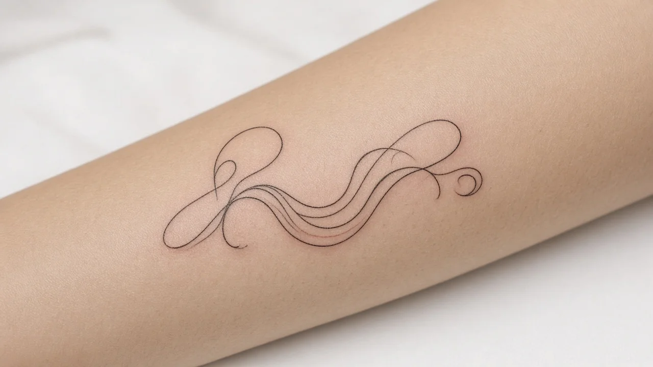
The same word in the same font can succeed on one part of the body and struggle on another. A few patterns to keep in mind:
- Forearm and upper arm. Long, relatively flat stretches suit horizontal phrases and flowing connections. This is a friendly home for most scripts.
- Collarbone. The area is narrow and curved, so lettering often needs a gentle arc and a compact capital.
- Ribs and side torso. Skin here moves and stretches, which can distort long phrases. Larger sizes and simpler letterforms help.
- Inner wrist. Space is tight and visibility high, so readability matters more than ornament. Sturdy scripts with open loops do best.
- Fingers and hands. These are notoriously tough spots. Keep lettering bold and simple, and expect your artist to have strong opinions.
- Sternum and chest. Vertical or symmetrical layouts are common, and the flow of the lettering often has to mirror the shape of the chest.
Size and placement are linked. A delicate script might be fine at forearm scale but fail at finger scale. If you have a favorite location in mind, mention it before you settle on a font, not after.
Turning a Font Into Tattoo-Ready Lettering
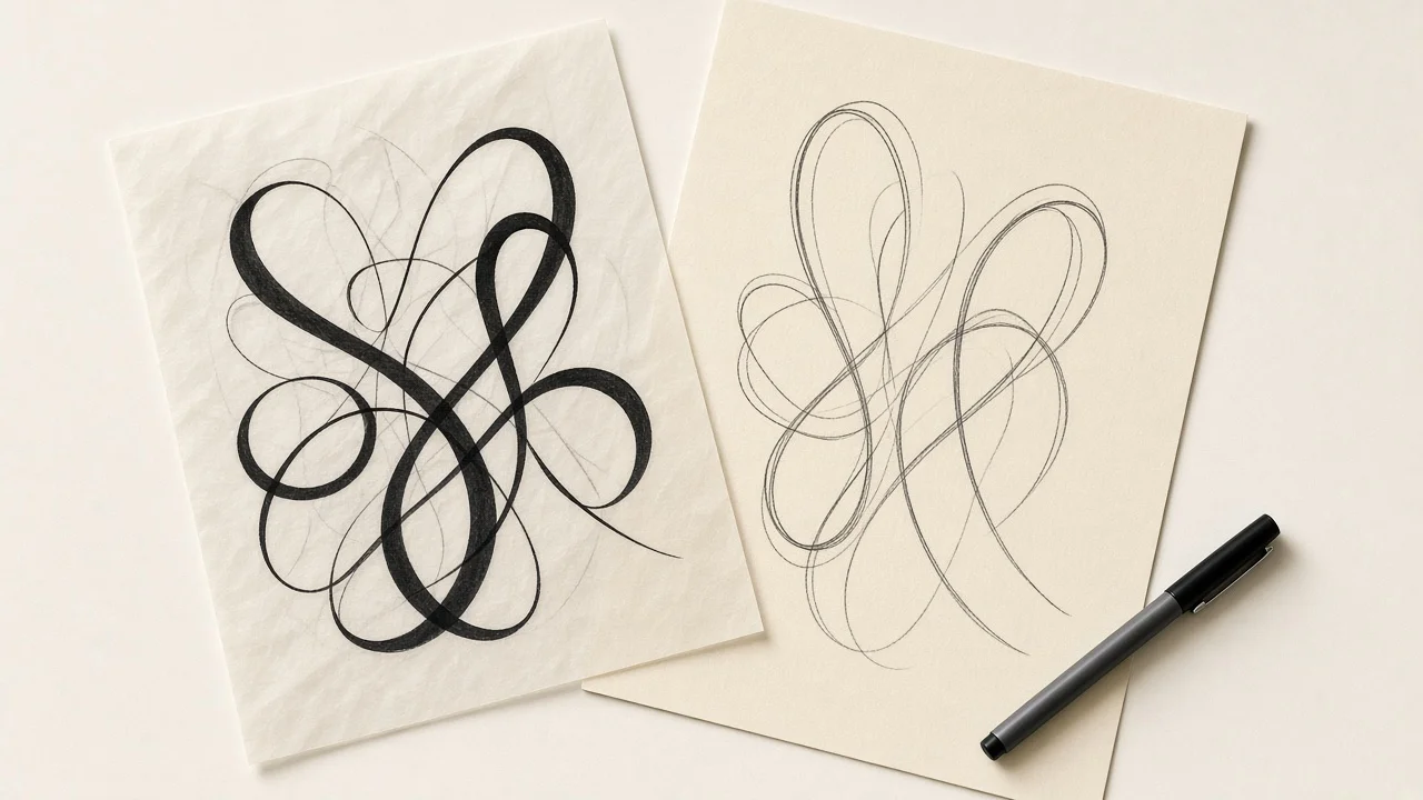
Think of the font file as a sketch. Most strong script tattoos involve a round of edits that a typical font user would never make. Typical adjustments include:
- Widening the spacing so neighboring letters do not crowd each other as lines soften.
- Thickening hairlines that would otherwise fade.
- Opening up small loops so they stay visible.
- Trimming or rerouting tails so they do not run into a joint, tendon, or the next word.
- Redrawing one capital to make it more legible or more personal.
This is where a skilled artist earns their fee. They can keep the mood of the original font while fixing the details that would cause trouble later, shaping the word to the curve of your body instead of pasting flat type onto a round surface.
Preview Your Words Before You Book
You will have a better consultation if you arrive with options rather than a vague description. A quick way to build them is to type your exact wording into the tattoo font generator and scroll through how it looks in different script styles. For a single name, the cursive name tattoo generator narrows things down further.
Cursive Generator draws on a library of 121 open-source fonts from the Google Fonts collection, hosted on the site and released under licenses such as the SIL Open Font License; the site states they may be used for tattoos and commercial work. Keep in mind that the generator previews these open-source fonts only. Commercial typefaces such as Bickham Script Pro 3, ITC Edwardian Script, Lavanderia, or Beloved Script are not part of that library, so you would view those through their publishers.
You can export favorites as a transparent PNG or an SVG file with no watermark, and the site runs in your browser without uploading what you type. That privacy is handy when the words are something personal, like a child's name or a memorial date.
Matching the Style to What the Words Mean
Legibility is the practical side of the decision, but tone matters just as much. The lettering should feel like the words it carries. A memorial date for a grandparent might call for something calm and traditional, where a restrained copperplate style suggests dignity. A child's name often suits a softer, rounder script with friendly loops. A favorite song lyric or a personal motto can carry more energy, and a bouncy, sign-painted style may capture that spirit better than a formal one.
Try this quick exercise. Write down three adjectives that describe the feeling you want the tattoo to have, such as "quiet, timeless, gentle" or "bold, playful, loud." Then look at each shortlisted font and ask whether it matches those words. A style that passes all five durability tests but feels wrong emotionally will not satisfy you for long. The ideal font sits where both answers overlap: sturdy enough to last, and expressive enough to feel like it belongs to you.
It also helps to consider other tattoos you have or plan to get. If you already have bold traditional work, an ultra-delicate script nearby may look out of place. If your existing pieces are fine-line, a heavy brush style could overpower them. Thinking about the collection as a whole keeps everything looking intentional.
A Note on Licensing
Licensing will not change how a tattoo heals, but it does matter for anyone creating design files. Commercial fonts come with terms that can restrict how a typeface is used in mockups, client work, or merchandise. Open-source fonts are typically much more permissive. If an artist or studio plans to use a font in marketing or prints based on your tattoo, they should confirm the license covers that use. For the open-source fonts on Cursive Generator, the site states that use in images, print, logos, tattoos, and commercial projects is allowed.
A Simple Workflow From Idea to Appointment
- Write the exact wording. Double-check spelling, dates, and punctuation. Small typos are permanent.
- Pick a placement and rough size. This narrows which scripts make sense.
- Shortlist three styles. Run each through the five tests above.
- Export previews. Save images of your shortlist so you can compare them side by side. The main Cursive Generator is a quick way to do this for open-source fonts.
- Bring everything to your consultation. Share the wording, placement, size, and previews, and invite your artist to adapt the lettering.
- Review the stencil carefully. Check spelling and readability once more before any ink goes down.
Frequently Asked Questions
What makes a cursive tattoo font easy to read years later?
Sturdy strokes, open loops, generous spacing, and modest decoration. Fonts that score well on all four tend to stay legible longer.
Can I tattoo a font exactly as it looks online?
You can, but most script tattoos benefit from adjustments. Artists typically widen spacing, thicken thin strokes, and simplify ornaments for skin.
How small can script lettering go?
It depends on the font, the placement, and your skin. In general, smaller tattoos need simpler, bolder lettering. Ask your artist for their recommended minimum.
Are free fonts safe to use for tattoos?
Check each font's license. Open-source fonts such as those under the SIL Open Font License are generally permissive, and Cursive Generator states its fonts can be used for tattoos.
Can I preview commercial fonts like Bickham on Cursive Generator?
No. The site previews its library of open-source fonts. Commercial typefaces have to be viewed through their publishers.
What should I bring to my tattoo consultation?
Your exact wording, your intended placement and size, and a few font previews. PNG or SVG exports from a generator make that easy.
Try it yourself — free
Runs in your browser. No sign-up, nothing uploaded.
Open the free tool →Related posts
How to Make a Tattoo Stencil from Text
Turn a name or quote into a clean tattoo stencil: pick a durable font, set the size, export an outline SVG or PNG and print at 100% scale. Free tool…
Read →
Cursive Capital Letters: A to Z Guide for Beginners
Learn cursive capital letters A to Z: why uppercase script differs from print, which capitals are hardest, and how to practice with free charts and…
Read →
Cursive Fonts for Instagram: Copy & Paste Script for Bios
How cursive fonts for Instagram work, why copy-paste script is really Unicode symbols, and how to use it in bios and captions while staying readable.
Read →