Cursive Capital Letters: A to Z Guide for Beginners
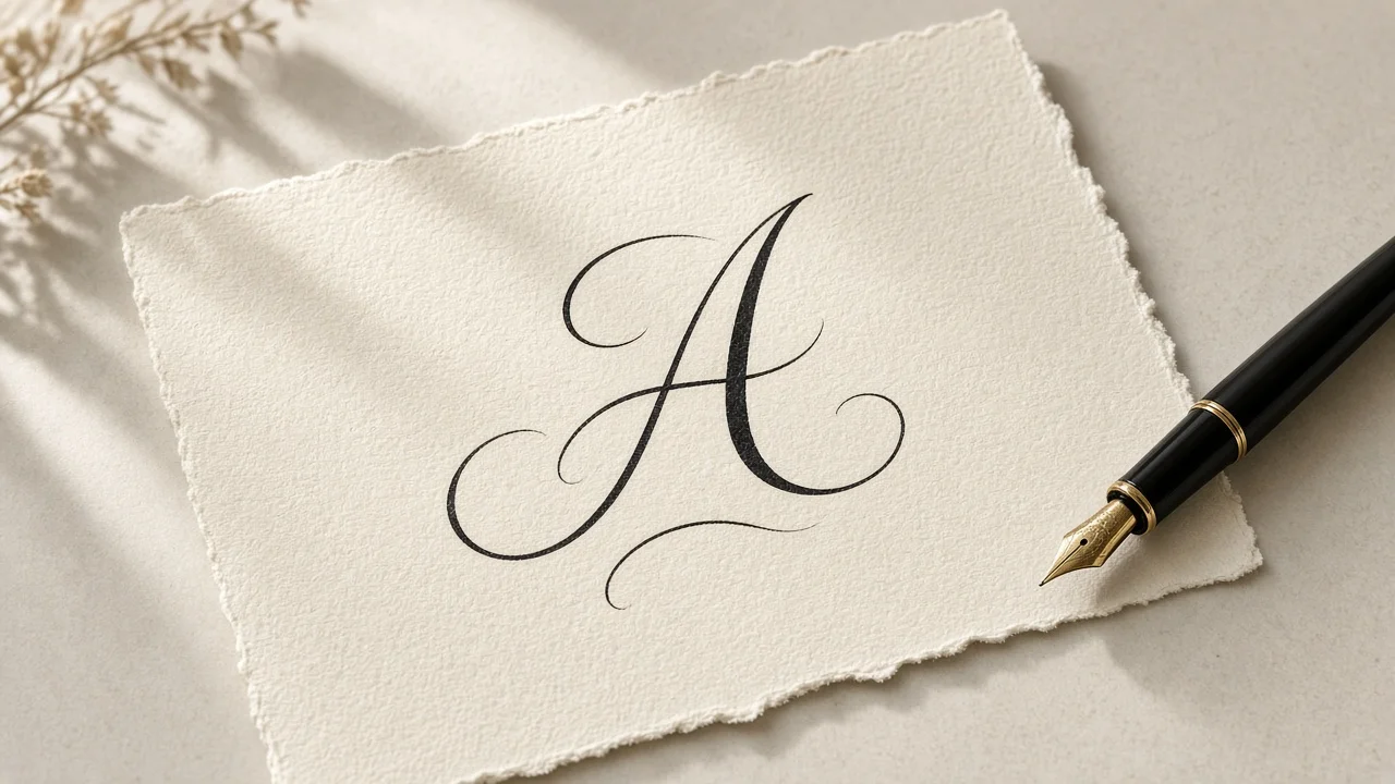
Most people who sit down to learn cursive capital letters get a small shock in the first five minutes. The capitals barely resemble the block letters they learned as children. A cursive A can look like a tilted, looping oval with a tail. A cursive F often reads like a tall T that picked up a second crossbar along the way. And the cursive Q is often mistaken for the numeral 2 at first glance.
None of this is random. Uppercase script letters were shaped for a different job than lowercase ones, and once you understand that job, the strange shapes start to make sense. In this guide we walk through what cursive capitals are, why they behave differently from small letters, how to organize your practice across the whole alphabet, and which letters deserve extra attention. You will also find a short routine for joining capitals to the rest of a word and a set of answers to the questions beginners ask most often.
Cursive Capital Letters, Defined
Cursive capital letters are the uppercase half of the cursive alphabet. Compared with lowercase script they are taller, they tend to carry more ornament, and in most American handwriting styles they are not joined to the letter that comes after them. They still share the slant and the rhythm of the word they begin, but they sit on the line as a separate unit.
That independence explains a lot. Because a capital does not have to flow into its neighbor, it is free to take on a shape that looks quite unlike its printed version. This is why letters such as Q, G, and Z change far more between print and cursive than any lowercase letter does. If you only want the short version, here it is: learn the capitals in families, give the awkward ones extra time, and keep a reference chart in front of you while you work. The rest of this article fills in the details.
Why Uppercase Cursive Looks So Different From Lowercase
Small cursive letters are built for linking. Each one is designed to finish on or near the baseline with an exit stroke that carries the pen straight into the next letter. Speed and continuity are the whole point.
Capitals follow a different set of rules:
- They are bigger, and many of them begin above the midline rather than on the baseline.
- Most of them stand apart from the lowercase letter that follows.
- They are more ornamental, with loops, swashes, and trailing tails appearing regularly.
- Writers usually lift the pen after finishing a capital, then start the lowercase letters fresh.
A helpful way to picture it is to treat each capital as the front door of a word. Capitals mark names, the start of sentences, titles, and places where you want emphasis. Their job is to be recognized at a glance, not to be written as quickly as possible, so their forms lean toward clarity of identity and a bit of flourish rather than raw efficiency.
This also explains why your uppercase practice may feel slower than your lowercase work. You are not doing anything wrong. Capitals simply ask for a slightly more deliberate hand, and that deliberate quality is exactly what makes a handwritten name or heading look polished.
A Step-by-Step Plan for Writing Capitals A to Z
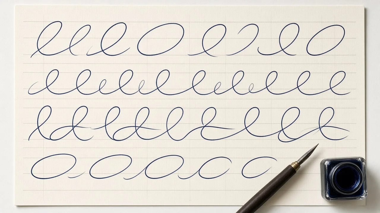
If your goal is to work through every uppercase letter from A to Z without getting lost, use this compact plan. Each step builds on the last.
- Understand what makes capitals different. Remember that they are taller, more decorative, and usually detached from the next letter. Keeping this in mind stops you from forcing joins that are not supposed to be there.
- Work in small families instead of alphabetical order. Group letters by the stroke they start with, such as the oval-based letters, the tall stem letters, and the slanted or humped letters. Moving through related shapes builds muscle memory much faster than jumping from A to B to C.
- Separate out the troublemakers. A handful of capitals, especially Q, Z, G, and F, cause most of the frustration. Give them their own practice sessions before you use them in names or sentences.
- Keep a complete chart nearby. A full A to Z reference lets you compare shapes side by side. The cursive alphabet chart on Cursive Generator shows every letter in script fonts, and each letter also has its own page if you want to focus on a single shape.
- Trace first, then write freely. Printable practice sheets with guide lines let you trace a letter and then write it unaided on a single sheet.
The sections that follow expand on each of these steps with a grouping table, quick tips, notes on the difficult letters, and a short FAQ. The order of practice stays the same throughout.
The 26 Uppercase Cursive Letters, Grouped by Shape
Below is the traditional American cursive uppercase alphabet, sorted into families based on how each letter begins. Tackling a few letters from one family at a time keeps sessions short and prevents the overwhelm that comes from trying all 26 at once.
| Family | Letters | What they have in common |
|---|---|---|
| Round-body family | A, C, D, E, G, O, Q | Your pen swings left into a rounded shape before anything else happens |
| Tall stem family | B, F, H, I, J, K, L, T | A long upright or slightly leaning stroke towers past the midline |
| Diagonal and hump family | M, N, R, S, U, V, W, X, Y, Z | Arches, angled strokes, and waves carry most of the shape |
| Stand-alone shape | P | A bowl sitting on a tall stem that drops toward or below the baseline |
Groupings like this are a guide rather than a law. Different handwriting programs draw some letters in slightly different ways, so you may see a capital placed in another family elsewhere. What matters is that you practice letters that share a starting motion together.
Quick Tips for Each Family
Round-body family. Draw the main oval first and make sure it is closed and evenly rounded. Only then add any tail, inner stroke, or flourish. Rushing the oval is the most common reason these letters look lopsided.
Tall stem family. Aim to keep every vertical stroke parallel to the others. If one stem leans further than the rest, a whole word will look untidy even if each letter is technically correct.
Diagonal and hump family. M and N rely on smooth, even humps, so keep the tops at a consistent height. Z uses a diagonal slash that catches many writers off guard, so slow down and watch the angle.
The stand-alone P. Focus on proportion. The bowl should sit comfortably at the top of the stem without swallowing it or looking too small.
Focusing on One Letter at a Time
Once you know the families, it helps to zoom in on a single capital whenever one is giving you trouble. Practicing a letter in isolation lets you study its starting point, the direction of each stroke, and where it ends, without the distraction of a full word.
Cursive Generator has an individual page for every letter of the alphabet, from A through Z, which is handy for this kind of focused work. A good habit is to choose one letter per session, write it slowly ten or fifteen times, compare each attempt with the reference, and then try it at the start of two or three real words. When the letter starts to feel automatic, move to the next one in the same family.
If you find that you are drifting from the reference shape after a few repetitions, stop and trace again. It is far easier to correct a habit after five attempts than after fifty.
The Hardest Capital Letters (Q, Z, G, F and a Few More)
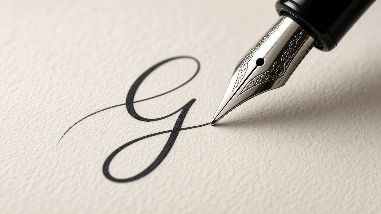
Four capitals account for most of the questions learners ask: Q, Z, G, and F. Several others, such as S, J, K, T, E, D, B, and I, also have a few traps worth knowing. Here is what to watch for with each.
Q
The traditional uppercase cursive Q pairs a rounded body with a long sweeping tail, and the result looks remarkably like a fancy number 2. Many people do not recognize it at all the first time. Practice the body and tail separately, then join them, and compare your attempts with the cursive Q letter page until the shape reads clearly as a letter.
Z
Uppercase cursive Z often opens with a small loop at the top before cutting diagonally downward, and in many styles it finishes with a loop that drops below the line. It shares almost nothing with the printed Z. Trace it slowly and repeatedly until the diagonal angle feels natural rather than forced.
G
Because a capital G starts out round and then drops into a tail, a hurried G is easily read as a C, an O, or even a Q. The fix is to pay close attention to where the stroke changes direction. Compare it with its oval-family neighbors so you can see exactly what sets it apart.
F
Capital F looks like a tall T with an additional crossbar. The usual mistakes are forgetting the second crossbar entirely or placing it so low that it collides with the next letter. Write the top stroke and stem first, then add the crossbar with a light, deliberate touch.
S
The trap with S is enthusiasm. If the upper loop swings too wide, the letter starts to resemble a C. If the lower curve collapses, it can look like a 5. Keep the loops balanced and moderate in size before using S in the middle of a sentence.
J
Capital J dips below the baseline and finishes with a hook. Lowercase j, by contrast, needs both a stem and a descender. Practicing the uppercase hook by itself is especially useful for initials and names, where J often appears.
K
Capital K joins a tall stem to two angled strokes. When the loops are written too quickly, the letter can drift toward R or H. Slow down on the diagonals and make sure they meet the stem cleanly before you try it in words such as Kind or King.
T
What makes or breaks a T is where the crossbar lands: draw the stem with confidence, then float a light bar near the top where the eye expects it. Getting the timing of that crossbar right is what keeps T distinct from F and L.
E
Uppercase E tends to open with the same small loop you might use for a C or an L. Its lowercase cousin has a different job: it must shut its little eye neatly while still flowing into the next letter. Practicing the capital on its own helps you separate the two motions in your mind.
D
Capital D belongs with C and O in the oval family. Lowercase d, meanwhile, is a tall letter with a round bowl that can look like cl when it is rushed. Work on the oval body and the stem as two distinct parts.
B
Capital B stacks two rounded bowls against a vertical stem. If those bowls are cramped, the letter can resemble P, R, or even the number 8. Give each bowl enough room before you use B in words like Beauty or Brave.
I
Capital I is essentially a tall stem with a little curve, but its lowercase partner depends on dot placement. Forget the dot on a small i and it turns into an l. Practicing both together reinforces the difference.
The common thread across all of these is simple: practice difficult capitals by themselves before you put them into words. Isolating a letter lets you correct its shape before a mistake becomes a habit.
Printable Practice: Charts and Worksheets
The most effective capital-letter practice pairs a clear visual reference with hands-on tracing. Looking at a model alone does not build muscle memory, and tracing without a reference makes it hard to spot errors. Doing both covers each weakness.
For a reference, keep the full A to Z chart open on your screen or printed at your desk, and refer back to it whenever a letter starts to feel unfamiliar. For tracing, the cursive worksheet generator on Cursive Generator lets you type any capital letter, word, or name and download a practice PDF. The page previews 26 teaching and handwriting fonts, and the PDF itself can be generated in any of 118 fonts. The sheets use four guide lines, including an ascender line, a dashed midline, a baseline, and a descender line, which is exactly what you need to judge the height of tall capitals and the depth of tails. You can choose between US Letter and A4 paper and pick a large, medium, or small writing size, so the same tool works for a young child and for an adult refreshing old skills.
A simple routine that works for most learners:
- Print one sheet featuring a single capital.
- Trace the letter along the guides several times, slowly.
- Write it freehand in the empty rows beneath.
- Finish by writing three short words or a name that begins with that capital.
Families learning together often get the best results by practicing the capitals in a child's own name first. Seeing a familiar word come together in script is a strong motivator, and names naturally include the capital letters that matter most to the learner.
Joining Capitals to the Rest of a Word
When you write a full sentence, capitals follow a short, predictable sequence:
- Write the capital letter and lift your pen.
- Set the pen down on the baseline for the opening lowercase letter.
- Join the remaining lowercase letters in the usual connected way.
Take the word Hello as an example. You write the capital H, lift, then connect e, l, l, and o in one continuous motion. The small gap after the capital is normal and expected in most school styles.
Some informal and decorative scripts do run the capital straight into the next letter, and you will see this in many cursive fonts. If you want to see how capitals and lowercase sit together in longer text, type a sentence into the Cursive Generator homepage and compare how different script fonts handle the transition. It is a quick way to get ideas for your own style before you pick up a pen.
Frequently Asked Questions
Is every uppercase cursive letter joined to the word after it?
No. In most cases the capital is written as a separate unit. A few informal styles try to link the capital to the following letter, but standard school cursive treats each capital as a separate stroke followed by a pen lift.
Which capital letter is the easiest to start with?
C and O are excellent first letters. Both are built from a single counterclockwise oval, which is also the foundation for several other capitals in the same family.
Are school cursive capitals the same as calligraphy capitals?
Calligraphy capitals usually feature elaborate flourishes and strong contrast between thick and thin strokes. Everyday cursive capitals are simpler and designed for writing at a reasonable speed. If you want to experiment with a more formal look, a calligraphy-style generator lets you preview decorative capitals before you try to copy them by hand.
Can I get a printable chart of all the capital letters?
Yes. The cursive alphabet page on Cursive Generator shows the full set of letters, and the site can export designs as transparent PNG or SVG files. For tracing practice, the worksheet generator produces a downloadable PDF.
Is there a good order for tackling the tricky letters?
Yes. Get the round-body and tall stem letters under control first, and only then move on to Q, Z, G, and F. By that point your hand will be steadier and the unusual shapes will be easier to learn.
Can a cursive capital be mistaken for a digit?
The traditional cursive Q is the best known example. Its rounded body and long tail read like a decorative 2. Other capitals can surprise people the first time they see them, including the zigzag Z and the open-bodied G, but Q is the one most often mistaken for a numeral.
Which uppercase letter gives learners the most trouble?
For most people it is Q, followed closely by G and Z. All three replace the familiar printed shape with an unfamiliar loop or tail. Practicing each of them in isolation, using a single-letter reference and a tracing sheet, is the fastest way through.
Is Cursive Generator free to use for practice materials?
Yes. Cursive Generator is a free, browser-based tool with no sign-up and no watermark on exports. Text is rendered locally in your browser, and the site draws on a library of 121 open-source fonts.
Keep Practicing
Learning cursive capitals is less about talent and more about patient, organized practice. Group the letters by shape, give the difficult ones their own time, keep a reference chart close, and move from tracing to freehand writing in small steps. Within a few weeks, the shapes that once looked strange, even that number-like Q, will start to feel like a natural part of your handwriting.
Try it yourself — free
Runs in your browser. No sign-up, nothing uploaded.
Open the free tool →Related posts
Cursive Fonts for Instagram: Copy & Paste Script for Bios
How cursive fonts for Instagram work, why copy-paste script is really Unicode symbols, and how to use it in bios and captions while staying readable.
Read →
Cursive Tattoo Font Guide: Pick a Script That Ages Well
How to choose a cursive tattoo font: five tests for script lettering, six well-known styles scored, placement and size tips, and how to preview your…
Read →
How to Sign Your Name in Cursive: Step-by-Step Guide
Learn how to sign your name in cursive: audit your handwriting, pick a format, build a signature in layers, and test it until it survives real-world…
Read →